Budget & Spending tracking App
User Experience Design|User Interface Design
Track spending fast
Most of the budget apps on the market provide a complete finance organization service and also provide users to save their spending in detail. But these features sacrificed the efficiency and convenience of saving spending.
Considering that we often have trivial spending in daily life. The circumstances where these trivial expenses happen are usually outdoors, on the side of the street which is not suitable for us to spend a long time typing and recording our expenses.
The app’s main goal is to let people save their trivial spending in a second, they can manage all their spending in a day without taking too much time.
Target Audience
people who want to record trivial spending in time before they forget but don’t have much time to enter the details of each spending.
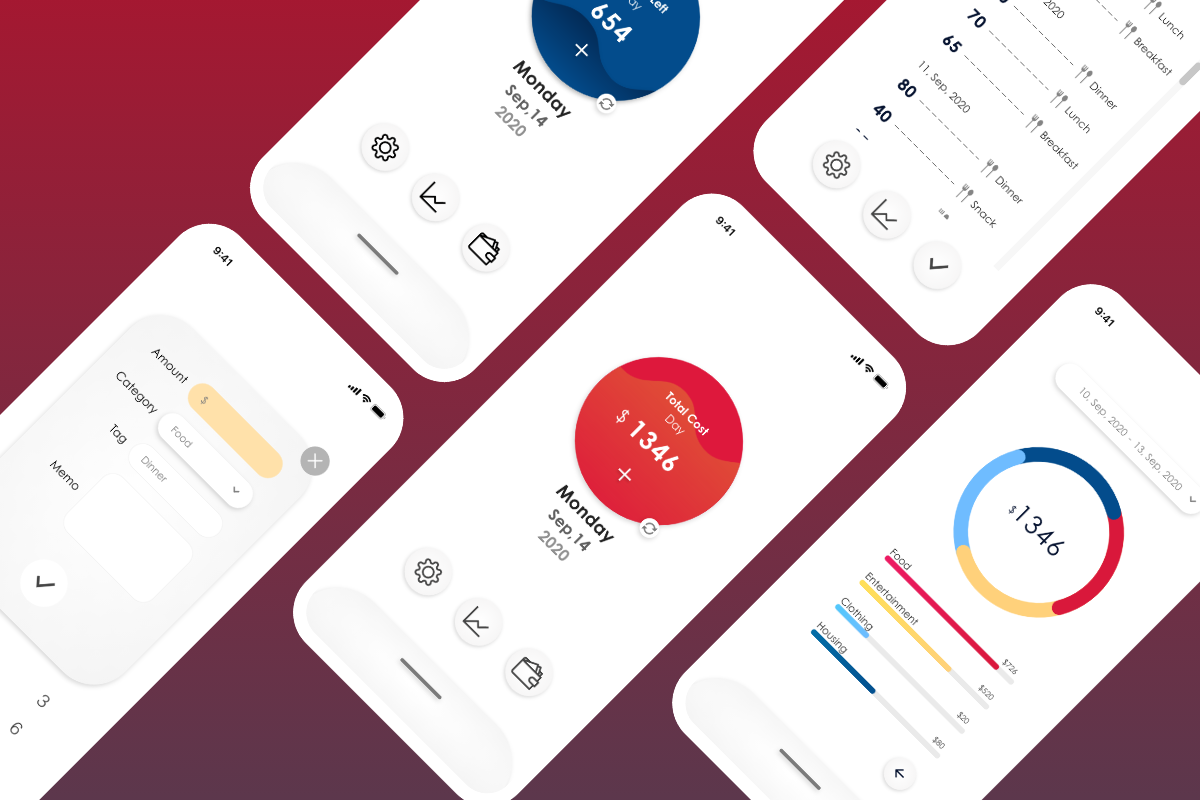
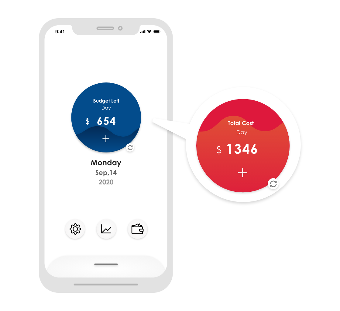
Considering the purpose of the app - fast record, the homepage has a big blue/red button in the middle. The button on one hand shows users’ total cost or budget left within a certain time. On the other hand the button lets people enter the spending entering page to start saving their spending.
Since the circumstances that people want to save trivial spending fast are usually not the places where people can sit down and use their phone chilly, therefore people might use one hand to open the app and save their spending. The big round button in the middle of the screen is also designed for both left hand and right hand users. No matter what dominant hand people are, they can touch the button with only one hand holding the phone without effort.
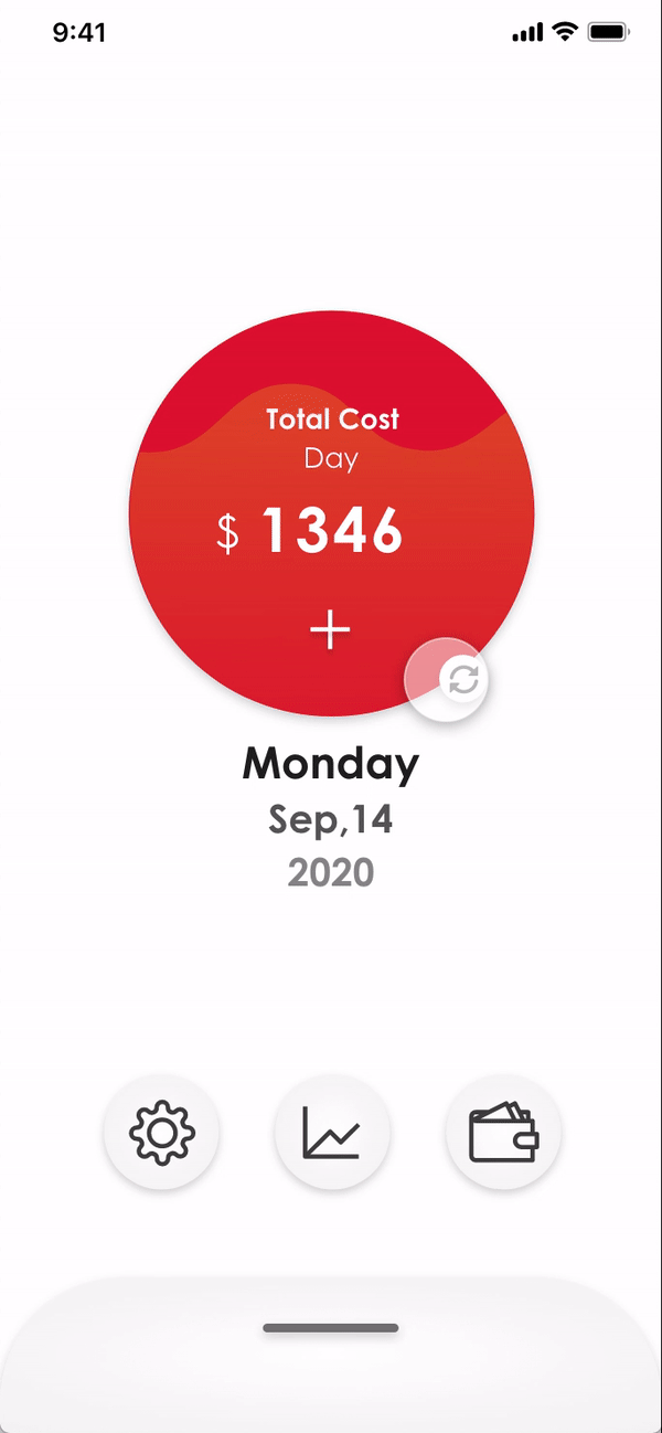
Besides saving spending efficiency, I want users to be able to check their total cost/left budget easily too. So the first thing they see is cost numbers when they open the app. Also considering some users prefer to know their total spend, some users prefer to know how much money they left and some want to know both. There is a button that can switch between total cost and left budget quickly, so users can save their time from doing calculations.
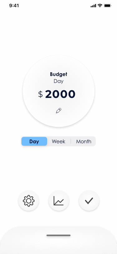
Some people plan a budget for a month, some people plan a budget for a week or even a day. To let all of the users use their own habit budget period, the app can set up a budget unit. And the budget unit the user chooses will apply to the homepage. For example, if a user set up a month's budget period, then his/her homepage's big round button will show his/her total cost/left budget of this month.
Overall interface design display
.gif)
Summary
The app cut off detailed spending records and some financial management features, giving users a light, efficient tool to save their daily spending and track their total cost. The app is designed to increase the convenience of people’s lives.
Thank you for taking the time reading this project :)
Back to homepage see my other works⇂
or get in touch
wwyuuna@gmail.com
+886 9 63 250 838